Row Zero pivot tables have a built-in percentile option for Values, so you can easily add percentiles to a pivot table. This lets you dynamically calculate percentiles by categories, unique IDs, date grouping, or any row/column aggregation. You can also calculate percentiles of filtered data and add percentile-based statistics like interquartile range and 5-number summaries to pivot tables.
This guide shows how to add percentiles to pivot tables and why pivot table percentiles are so useful, especially when analyzing big data. You can also view live examples of percentiles in pivot tables in Row Zero to try them for yourself.
View examples of pivot table percentiles
- How to calculate percentiles in pivot tables
- Examples of pivot table percentiles
- Why pivot table percentiles are useful
- Why percentiles are better than min and max
- Percentile function
How to calculate percentiles in pivot tables
Row Zero makes it easy to add percentiles to pivot tables with a built-in percentile calculation. Here how:
- Open a workbook and import your data: Login or sign up for free, open a new workbook, and import data via file or dynamic data connection.
- Create a pivot table: Select your data and go to Insert, Pivot table. Drag the relevant fields to rows and/or columns. Think of these as "a row for each" or "a column for each".
- Select a percentile calculation for Values field.: Drag the field you want to find the percentile for to Values, select Percentile, and choose the Percentile to return. You can choose from P10 to P99.9. This will return the chosen percentile for the Rows/Columns selected.
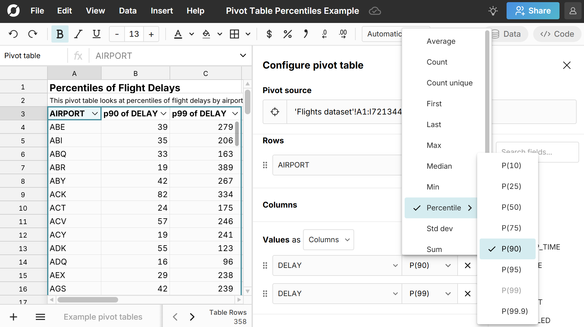
If you add filters to your pivot table, it will calculate the percentiles after filters are applied. As you edit your pivot table or update your source data, the pivot table percentiles will automatically update, so you can easily build a connected spreadsheet that automatically re-calculates percentiles as new data is added.
Here is a step-by-step video on how to add percentiles to pivot tables:
Examples of pivot table percentiles
Here are live examples of percentiles in pivot tables so you can see exactly how it works. Below, we walk through these examples of different calculations you can do with percentiles in pivot tables.
Pivot table quartiles
Quartiles are just percentiles at 25th, 50th, and 75th, so adding quartiles to pivot tables is just as easy as adding any other percentile to your pivot table as shown above. Simply drag your field to Values and select P25, and then repeat the process for P50 and P75. 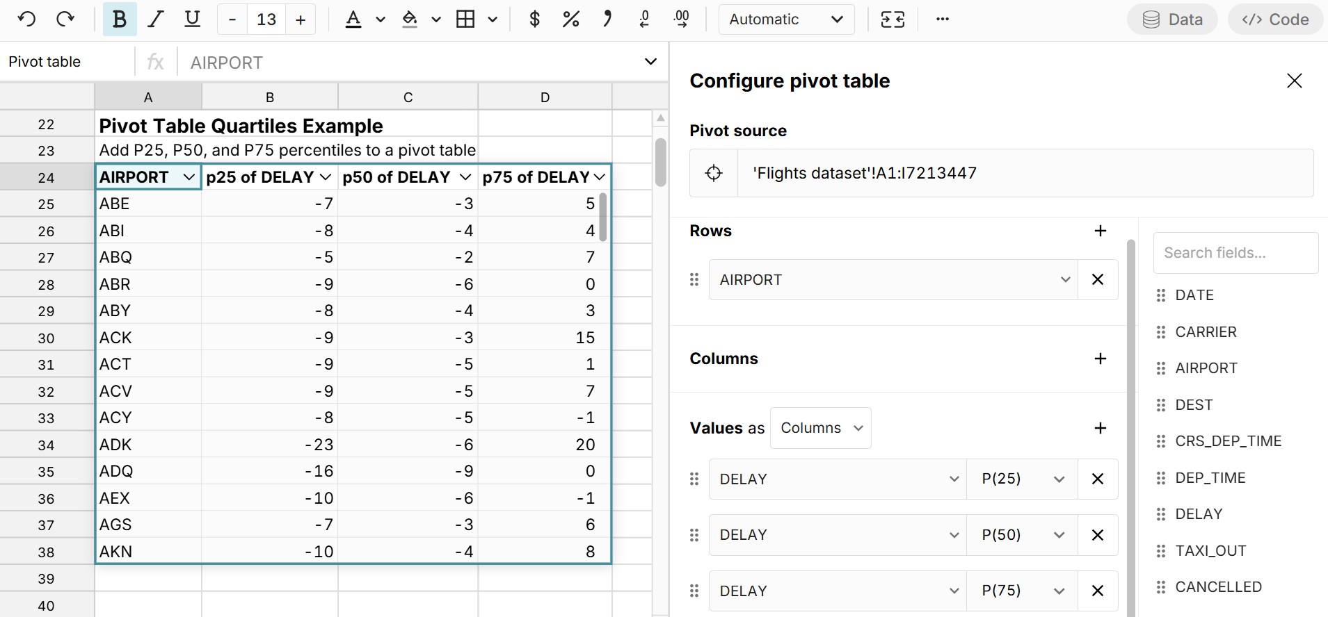 When evaluating a distribution, pivot table quartiles give a quick sense of the data, but it's helpful to also extend to P10 on the low end and P90 or P99 on the high end.
Pivot table interquartile range (IQR)
Since you can calculate quartiles in the pivot table, you can also calculate the Interquartile Range (IQR) in a pivot table by adding a calculated column that subtracts the 75th percentile minus the 25th percentile. To add a calculated column, simply type your formula in the first column to the right of the pivot table, reference a pivot table column(s) in your formula and hit enter. 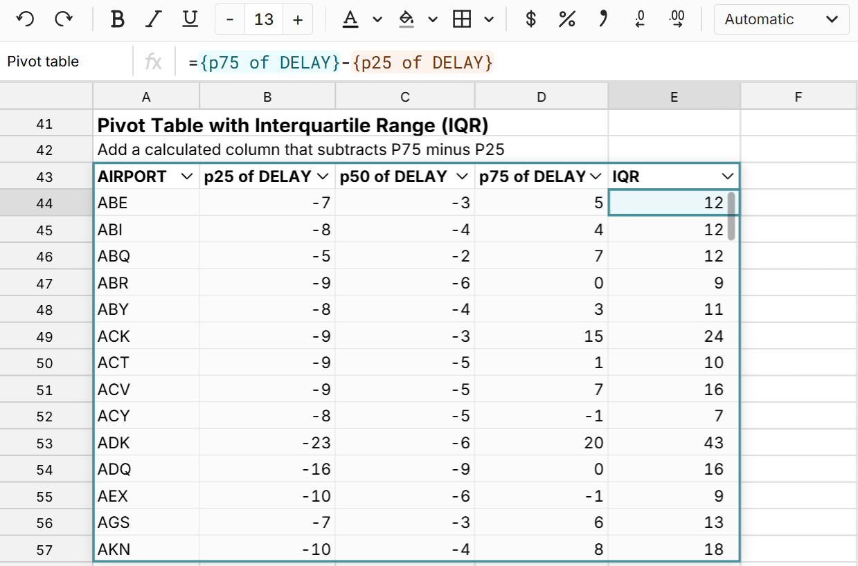 The interquartile range is added to the pivot table and will dynamically update as the pivot table changes or the source data updates.
Pivot table five-number summary
You can easily add a five-number summary to pivot tables by adding your field to Values 5 times and selecting Min, P25, P50 (or Median), P75, and Max. 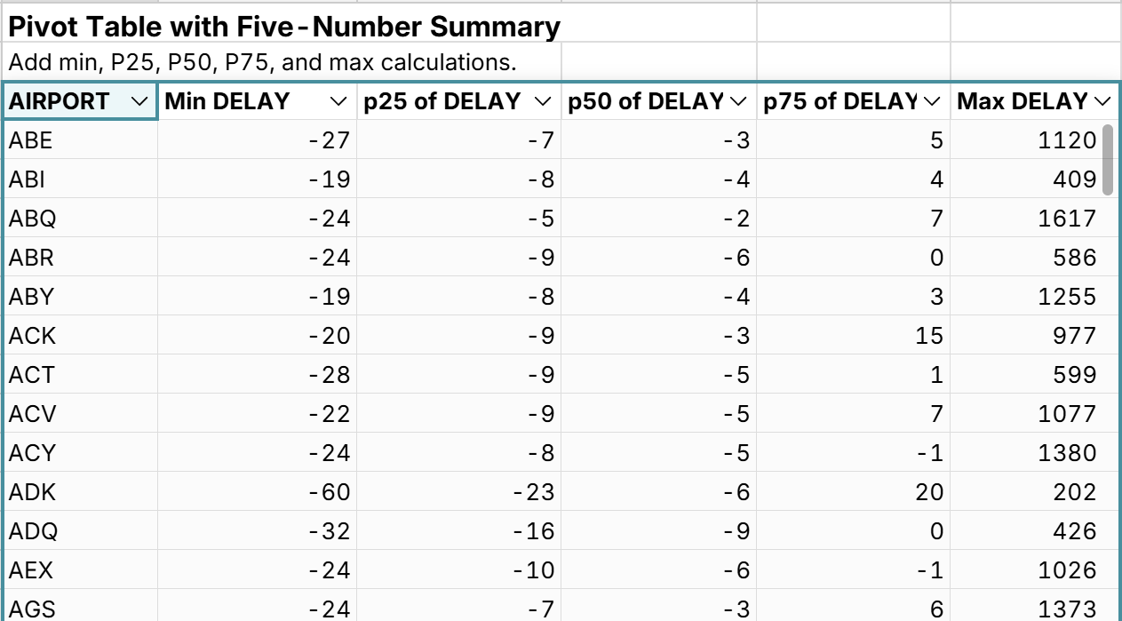 While the 5-number summary is useful for smaller datasets, when working with larger datasets, the minimum and maximum values become less meaningful, so you may want to swap min and max for P10 and P90 (or P99) or expand the 5 number summary to a seven-number summary or greater to get a more useful evaluation of the distribution.
Calculate percentiles by month
One great thing about pivot table percentiles is that the percentiles are calculated for whatever row and column aggregations you've added to your pivot table. Since you can group pivot tables by date in Row Zero, that means you can easily calculate percentiles by month, quarter, week, or any other date/time grouping. 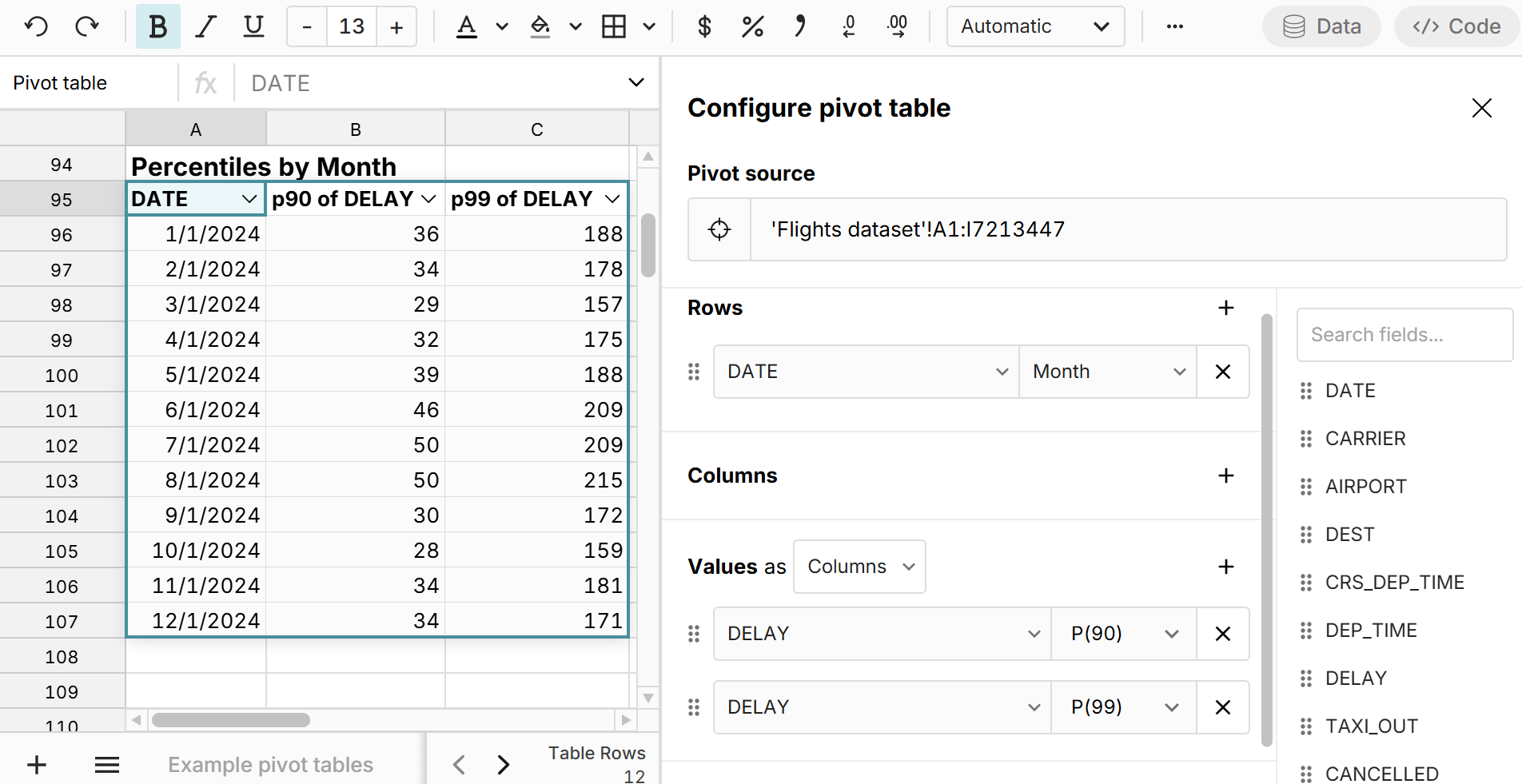 In the example above, you can toggle between month, week, quarter, etc. and the percentiles update dynamically for the given aggregation.
Calculate filtered percentiles
Similarly, you can calculate percentiles of filtered data using pivot table percentiles. Simply apply Filters to your pivot table, and select percentiles as Values and the percentile calculations will be applied to the filtered dataset. 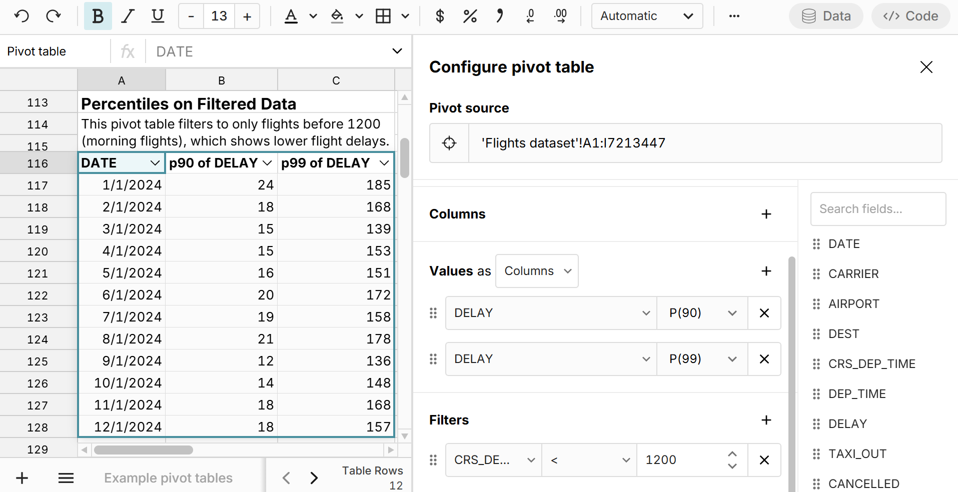 You can use this to filter out bad data or outliers or simply to further slice your data. In the example above, we filter to only flights before 1200, which shows that delays look to be much lower for morning flights.
Percentile charts
By adding percentiles to pivot tables, you can easily compare percentiles across all row or column aggregations and chart percentile distributions. 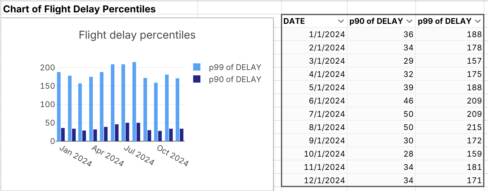
Calculate percentiles of percentiles
Row Zero makes it easy to create pivot tables from pivot tables, so you can easily calculate percentiles in your first pivot table and then use that as a source for your 2nd pivot table where you can calculate percentiles of percentiles. In the example below, we first calculated the P90 flight delay across airports and then pivot that pivot table to calculate percentiles of percentiles to get a sense for the distribution of P90 flight delays. 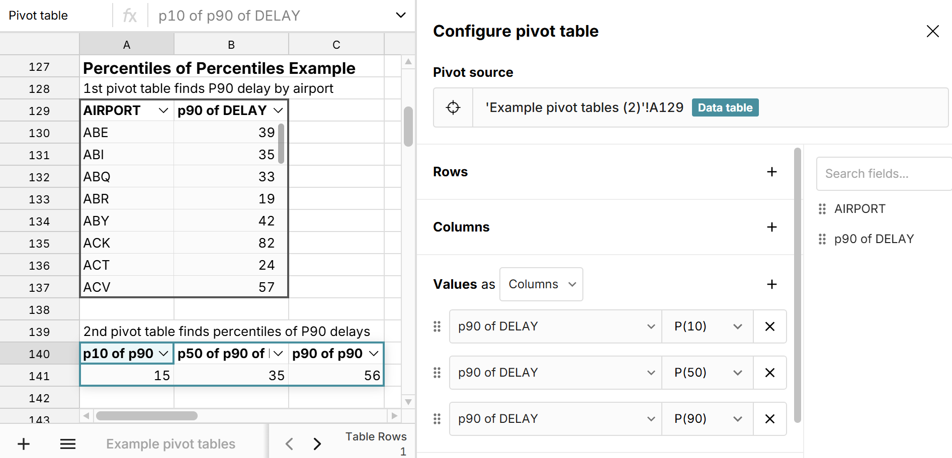
Why pivot table percentiles are useful
Pivot table percentiles are very useful for quickly evaluating the distribution of a range of values across different categories and summary levels. When you add percentiles to pivot tables, the percentiles are dynamically calculated for whatever row and column aggregations are in the pivot table as well as whatever filters are applied to the pivot table. This lets you quickly calculate distributions of large datasets across a myriad of slices and dimensions. We can see this in the flights example above. While you can use the percentile function to calculate the P90 delay across the total distribution of flights, you can use a pivot table P90 to calculate the P90 delay across all airports at once.
While you can add min, max, median, and mean to pivot tables, adding percentiles to pivot tables gives you a much better view of the distribution and lets you easily add a five-number summary to pivot tables and other statistical methods that rely on percentiles.
Why percentiles are better than min, median, and max
Percentiles are better than max, min, and median because they give you a more granular visualization of a distribution. When working with large datasets, the min and max can be extreme outliers or errors that don't tell you much about a distribution. However, percentiles like P10 and P90 give you a good sense of what a typical "bad" and "good" value are in the distribution. For example, for the flights dataset analyzed in the examples above, the min, median, and max flight delays are pretty useless. Across 7 million flights, the min and max flight delay doesn't give you any real insight into flight delays and the median is -2 mins, since the majority of flights are on time. However if we look at P90 or P99 for flight delays, we get a sense of what a typical delay looks like across airports and carriers. 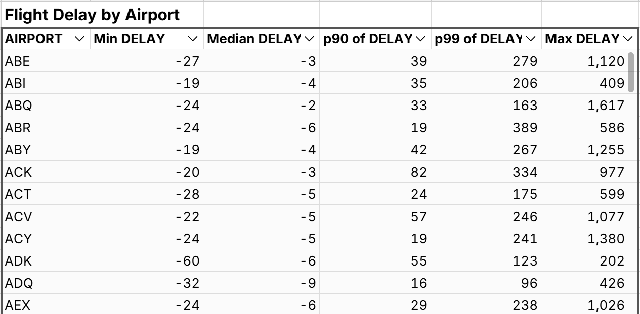
Percentile function
The PERCENTILE function provides an easy way to calculate percentiles in a spreadsheet outside of pivot tables and lets you calculate percentiles at a more granular level. The percentile function takes 2 arguments:
- Values - the data to compute the percentile for
- Percentile - the specified percentile value to compute between 0 and 1.
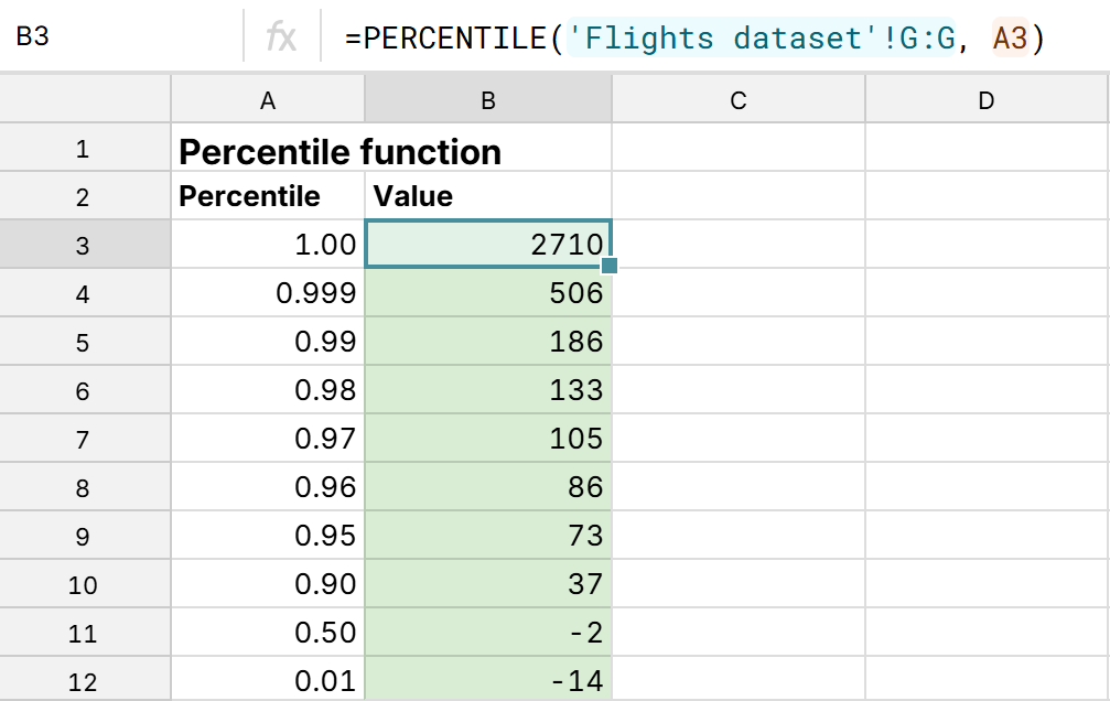 Note that P100 is the same thing as the maximum and P0 is the same thing as the minimum. You can view an example percentile function in a spreadsheet here. Unlike pivot percentiles, you can use the PERCENTILE function in Excel and Google Sheets.
Conclusion
It's easy to add percentiles to pivot tables in Row Zero using the built-in percentile calculation for Values. Pivot table percentiles are unique to Row Zero, as you cannot add pivot table percentiles in Excel or Google Sheets. Pivot table percentiles are particularly useful for calculating percentiles at a category or summary level and comparing percentiles across these categories. You can also use percentiles and a calculated column to add interquartile range to a pivot table along with a 5-number summary or any other percentile-based calculation. You can view live examples of pivot table percentiles in a spreadsheet here or try Row Zero for free to analyze big data in a powerful spreadsheet.