Pivot charts are charts created from pivot tables and are a great way to visualize large data sets. Dynamic pivot charts auto-update as source data changes or as pivot tables are filtered or edited. Like dynamic pivot tables, they're often connected directly to a live data source like a data warehouse. It can be a challenge to create a dynamic pivot chart in Excel or Google Sheets with big datasets. Excel pivot tables and pivot charts do not auto-update by default. Excel and Google sheets also have data size limits of around 1 million rows, so they're not an option for pivot charts from large datasets. Row Zero is a next-gen spreadsheet built for big data and dynamic data analysis. Row Zero pivot charts are dynamic by default - they auto-update as source data changes, connect directly to your data sources and support billion row data sets.
In this pivot chart guide, we’ll show you how to create dynamic pivot charts from pivot tables in Row Zero, Excel, Google Sheets, Tableau, and Power BI and show why Row Zero is the best spreadsheet for big data and dynamic data analysis. Skip to a specific section below or keep reading for the full guide.
- Dynamic pivot charts and big data: Row Zero
- Create a dynamic pivot chart from a pivot table
- Excel pivot charts from pivot tables
- Google Sheets pivot charts from pivot tables
- Pivot charts in BI tools
- Conclusion
Dynamic Pivot Charts and Big Data - Row Zero
Row Zero is a next-gen spreadsheet built for big data and dynamic data analysis. Row Zero pivot tables and charts are truly dynamic. They auto-update as source data changes and they can connect directly to your data source (e.g. Postgres, Snowflake, Amazon S3, etc.). Since Row Zero supports billion row spreadsheets (1000x Excel's max row limit), you can create pivot charts and pivot tables from large datasets too big for Excel and Google Sheets.
Create a dynamic pivot chart from a pivot table
Row Zero makes it easy to create dynamic pivot charts that dynamically connect to your data source and automatically update. Here's how:
Open up a workbook in Row Zero:
Login or sign up for free to get startedConnect to your data source
To create a truly dynamic pivot chart or pivot table, connect directly to your data source. Click "Connections" in the top right.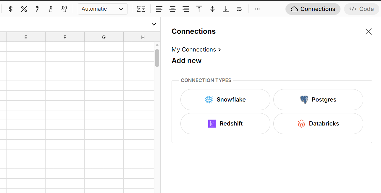
Select * from the table(s) you want
Row Zero's big data capabilities let you import entire database tables, so you can write a SQL statement as simple as "Select * from your_table_name" in most cases (you can also write more complicated SQL if you like) and click Run.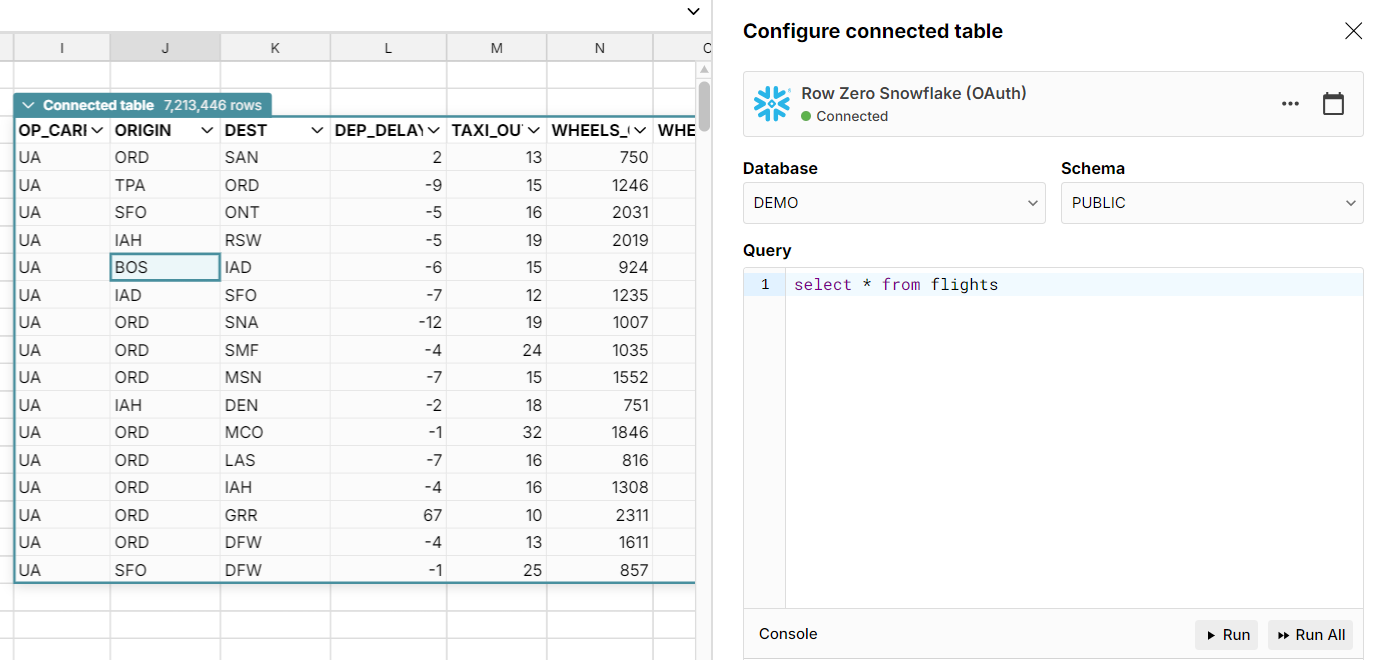
A connected table is created
Connected tables are live data tables, connected to your data source that dynamically update as your source data updates.Create a pivot table
Click the dropdown header on your connected table and select Pivot. Choose your location and then select your pivot table rows, columns, values, and filters.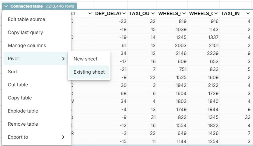
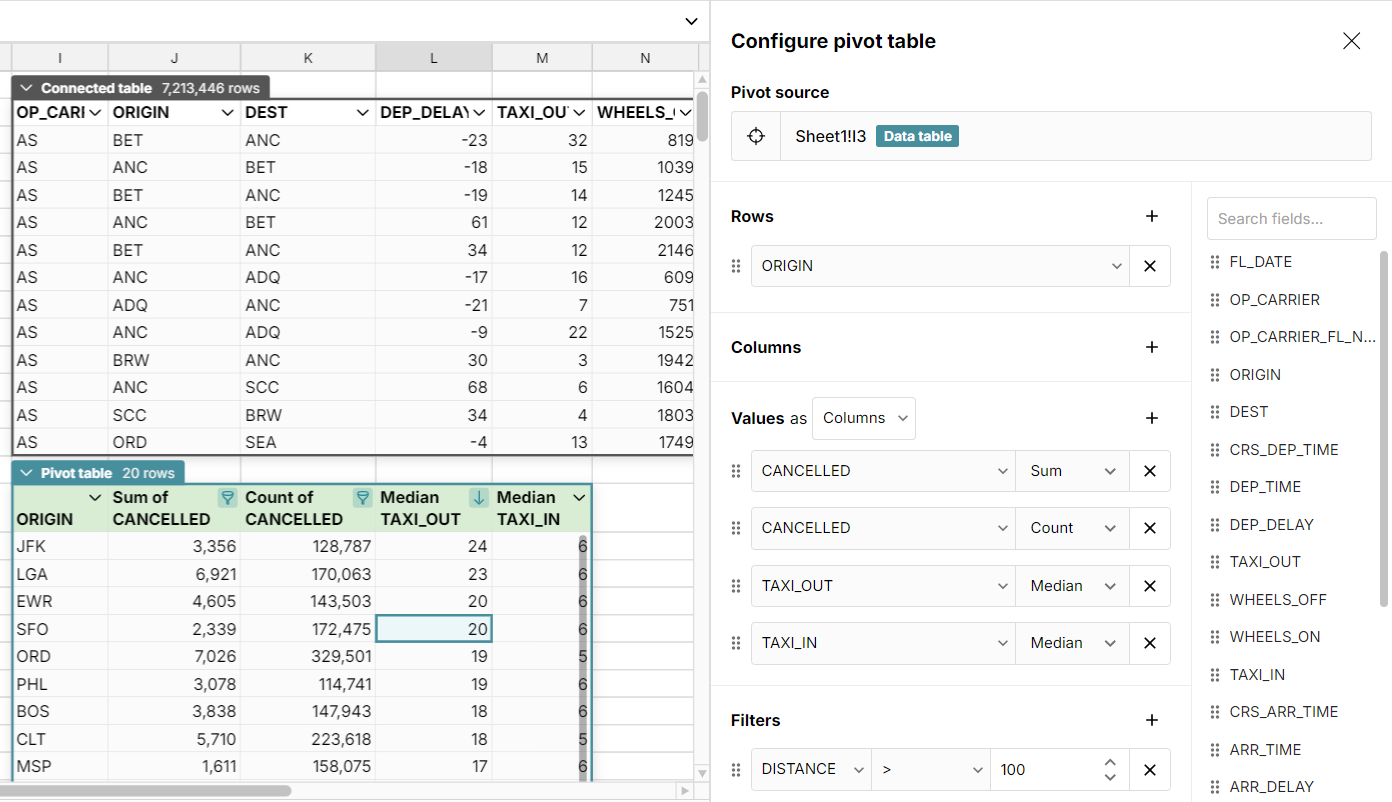 This is a dynamic pivot table directly connected to your source data. You can easily edit, filter, sort, and format your pivot table. You can also build formulas, charts, and even more pivot tables on top of your pivot table.
Create a pivot chart from your pivot table
To create a chart or graph from a pivot table, click a cell in each column you want to include in your chart and click Insert, Chart.

Result: A dynamic pivot chart synced to your data source
You pivot chart is fully in sync with it's underlying pivot table and data source. If you update your source data or filter your pivot table, your pivot chart updates dynamically in real-time. You can also schedule data refresh to automate updates. Note: while this example shows a connected pivot table, you can also create pivot tables and interactive pivot charts from cell ranges in any sheet and these pivot tables and pivot charts will automatically update any time you change data in the source range.
Bonus Points: Dynamic dashboard of pivot charts and pivot tables
With Row Zero's big data power, you can create a dynamic dashboard with multiple pivot tables and pivot charts from multiple sources in the same sheet. If you've connected to your data sources this dashboard updates automatically when you refresh source data. 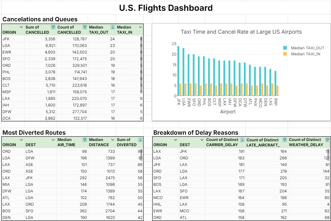
Try Dynamic Pivot Tables and Charts in Row Zero
Excel Pivot Charts from Pivot Tables
It's fairly straightforward to build pivot tables and pivot charts in Excel. However, they do not auto update by default and it's a bit more challenging to connect to source data and create dynamic pivots in Excel. If you're working with large datsets or database tables, it's important to be aware of Excel's max row limit of 1,048,576 rows. You may need to first slice or filter your data before pivoting. The dataset we used in the Row Zero example above had 7.2 million rows, so we'll use a simpler dataset for this Excel pivot example. Despite these limitations, Excel pivot charts and pivot tables offer many unique features.
How to create pivot charts in Excel
Open up a workbook and get your data ready
You can start from scratch with a blank workbook or click Data and then Get Data in the top navigation to import a file directly from your computer and other sources.Select your data and insert pivot table
Select the data you want to pivot and click Insert, Pivot Table to create a pivot table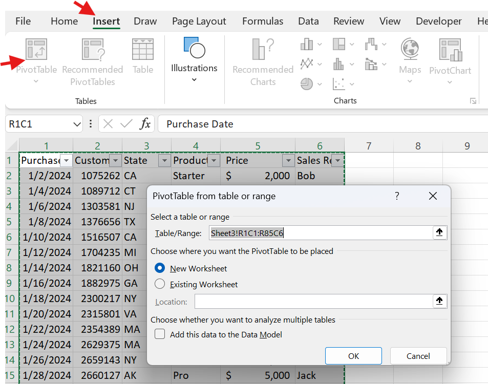
Configure your pivot table
Drag your rows, columns, values, and filters to build your pivot table.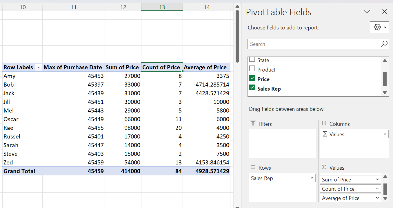 Change the calculation applied to a value field by clicking on the value and selecting "Value Field Settings".
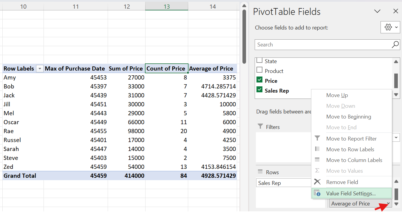
Create a chart from your pivot table
To create a pivot chart or graph from your pivot table click any cel in the pivot table and go to Insert, PivotChart. Choose your location and chart type to create your pivot chart.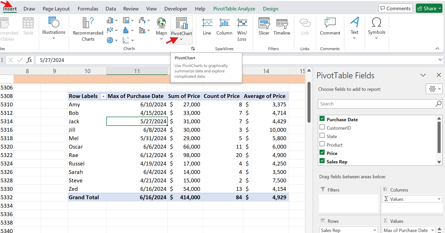
 Once your pivot chart is created, you can edit your chart by clicking on any of the field buttons or right clicking on the chart.
Important notes about Excel pivot charts
- Your pivot chart is connected to the underlying pivot table. If you edit either the pivot chart or the pivot table, those edits happen in both places.
- If you want to only chart part of your pivot table, you'll need to click on any cell outside the pivot table and insert a blank chart. Then right click on the blank chart and click Select Data. From here, you can select a specific cells in your pivot table to chart.
- You can create Excel pivot charts directly (without first building a pivot table) by selecting your data range and clicking Insert, Pivot Chart. From here the steps are similar to those above.
- Excel pivot tables and charts are NOT dynamic by default. By default, they do not update in real-time as you change the source data. See below for how to update Excel pivot tables and charts.
- If you work with large datasets, you'll need to first trim or filter your dataset under Excel's 1,048,576 row limit before creating your pivot tables and charts. For big data analysis, Row Zero is a good Excel alternative for large datasets.
Updating pivot charts and tables in Excel
When you add, delete or change data in your source range, Excel pivot tables do not update automatically in real-time. To update Excel pivots, you have a few options:
- Keyboard Shortcut: Hit Alt + F5 to refresh only the active pivot table. Ctrl + Alt + F5 to refresh all pivot tables in the workbook.
- Right-click on the pivot table and select Refresh
- Go to PivotTable Analyze in the header and click Refresh
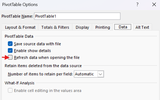
- Update on file opening: Right-click on the pivot table, select PivotTable Options, Data, and check Refresh data when opening the file.
- To automatically update Excel pivot tables in real-time, you need to use VBA to set up auto-updating pivot tables.
Google Sheets Pivot Charts from Pivot Tables
Google Sheets pivot tables and charts are dynamic by default and automatically update with data changes.
Creating a pivot chart in Google Sheets
Get your data ready
You can start from scratch in a blank workbook or click File, Import to import a file directly from Google Drive, your computer, and other sources.Select your data and insert pivot table
Select your data to pivot and go to Insert, Pivot Table to create a pivot table.Configure your pivot table
Drag your rows, columns, values, and filters to build your pivot table. To change value field calculations, adjust the dropdown under "Summarize by"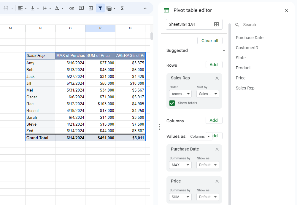
Create a chart from your pivot table
To create a pivot chart, select the data in your pivot table that you'd like to chart and go to Insert, Chart. This works just like any other chart in Google Sheets.
Your pivot chart remains in sync with your pivot table. If you edit your pivot table, your pivot chart will update accordingly. And if you update source data, updates will flow through to your chart in real-time. If you need to work with large data sets above Google Sheets max data size, Row Zero is a great Google Sheets alternative for big data analysis.
Create Pivot Charts in BI Tools
You can create pivot charts from big datasets in several BI tools. We'll walk through how to create pivot charts in Tableau and Power BI below. The process is similar with other BI tools.
How to Create Pivot Charts in Tableau
1. Connect to your data:
- Open Tableau and connect to your data source (SQL, large CSV, data warehouse, etc.).
- Once connected, go to a new worksheet.
2. Pivot your data:
- To pivot data in Tableau, go to the Data Source tab.
- Select the columns you want to pivot, right-click, and choose Pivot.
3. Drag fields to the appropriate shelves:
- Rows: Drag the dimension (categorical field) you want to group by to the Rows shelf.
- Columns: Drag the dimension you want to display as columns to the Columns shelf.
- Values: Drag the measures (numeric data) you want to visualize onto the Text shelf (for tables) or the Marks shelf (for visualizations).
4. Customize the chart:
- Select the type of chart you want from the Show Me panel. For pivot charts, you typically use bar charts, heat maps, etc.
- Adjust filters, colors, and labels as needed.
How to Create Pivot Charts in Power BI
1. Connect to your data:
- Open Power BI and load your data (Excel, CSV, database, etc.).
2. Pivot your data:
- To pivot data in Power BI, go to Transform Data (Power Query Editor).
- Select the columns to pivot, then choose the Pivot Column option from the Transform menu.
3. Create a visual:
- Once in the report view, go to Visualizations.
- Drag your categorical field (dimension) to the Axis section.
- Drag another categorical field to the Legend section (optional, depending on your visual type).
- Drag your numeric data (measures) to the Values section
4. Choose a chart type:
- Power BI automatically suggests a chart type, but you can change it by selecting the chart type from the Visualizations pane.
5. Customize the chart:
- Add filters, adjust formatting, and customize the chart to fit your needs.
Conclusion
Dynamic pivot tables and charts are powerful spreadsheet tools to filter and analyze large datasets and are especially useful when connected directly to your data source. Row Zero pivot charts and tables are truly dynamic. They sync directly with your data source and update automatically as source data is changed. Most importantly, Row Zero supports massive datasets, so you can pivot database tables and create pivot charts and pivot tables from big datasets. You can also build dashboards of multiple pivot tables and charts from multiple sources. Row Zero makes it easy to analyze big data in a spreadsheet. Ready to try it out?
Create Dynamic Pivot Charts and Tables in Row Zero