Waterfall charts make it easy to visualize change between a start and end value, especially when there are both positive and negative contributors to the change.
This quick guide shows how to create a waterfall chart and highlights some advanced features of waterfall charts in Row Zero. Row Zero is an enterprise-grade spreadsheet built for big data that makes it easy to build dynamic waterfall charts in big spreadsheets. You can connect directly to your data source to automate waterfall chart updates and add slicers to waterfall charts to further analyze sub-categories. View live waterfall chart examples here or continue reading for the full tutorial.
View example waterfall charts in a spreadsheet
- What is a waterfall chart?
- How to build a waterfall chart
- How to automate waterfall chart updates
- Example waterfall charts
- 3 reasons Row Zero waterfall charts are powerful
- Pros and cons of waterfall charts
What is a waterfall chart?
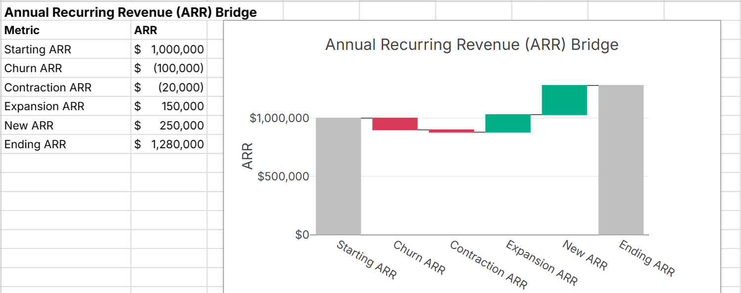
A waterfall chart is a type of data visualization that shows how a starting value is incrementally impacted by a series of positive or negative values to result in an ending value. Waterfall charts are used when you want to break down the components of a total or explain the step-by-step changes between two values.
There are 3 key components of waterfall charts:
- Starting value
- Contributing increases and decreases
- Final total
Since waterfall charts show how values "bridge" from a starting point to an end point, they are sometimes referred to as bridge charts.
How to build a waterfall chart
Row Zero makes it easy to create dynamic waterfall charts in big spreadsheets. Here's how:
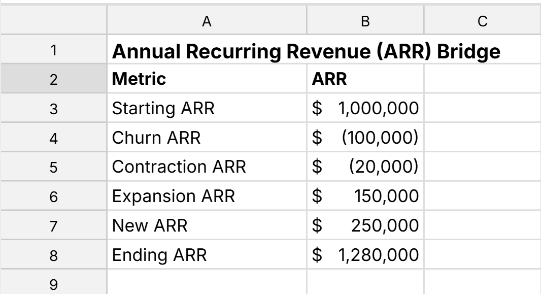
- Open up a Row Zero workbook and get your data ready. You can import a file or connect to your data source to build a connected waterfall chart. Data should be organized around a common value and include the starting value, ending value, and any components that you want to visualize. Include a column for values and a column for labels as shown below:
- Select the range of cells to create your chart from and go to Insert, Chart in the header.
- Select your chart type as Waterfall chart.
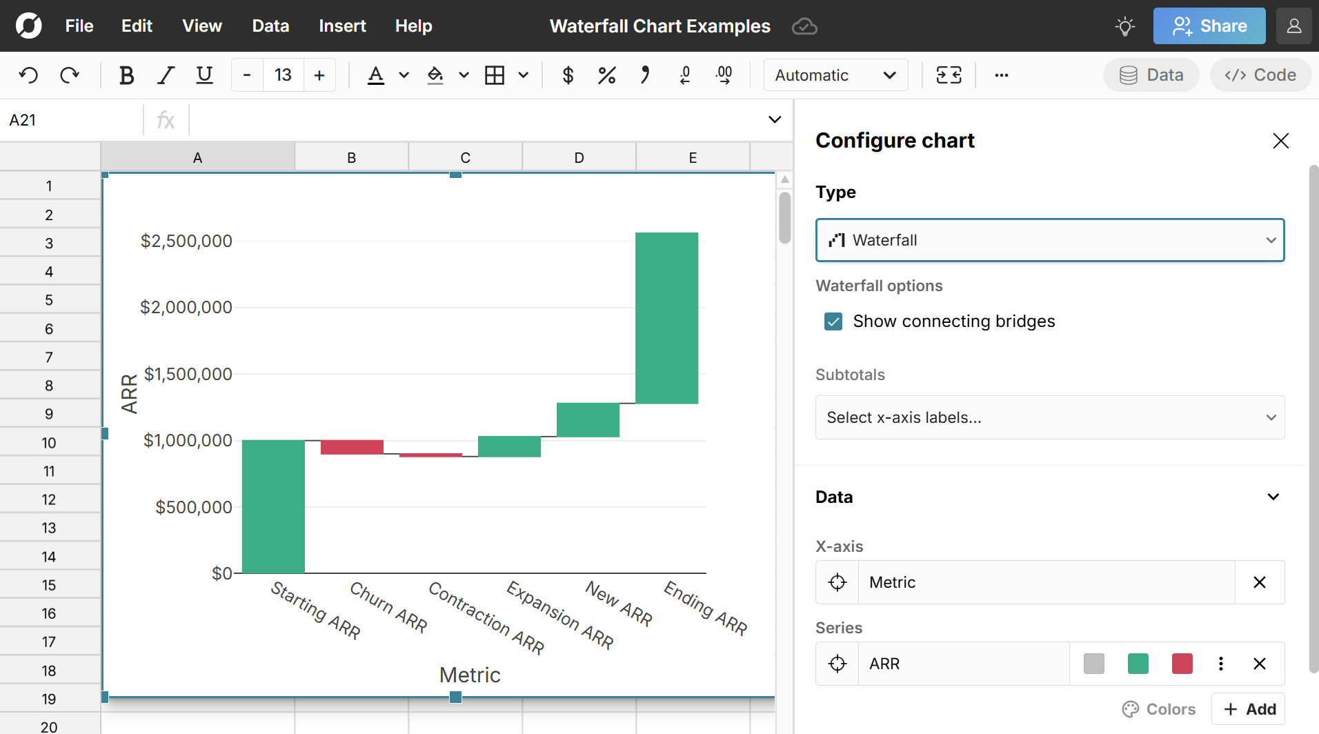 You have several options to configure your waterfall chart:
- Show connecting bridges - these are optional lines between each bar if you want to connect the "bridge" from start to finish
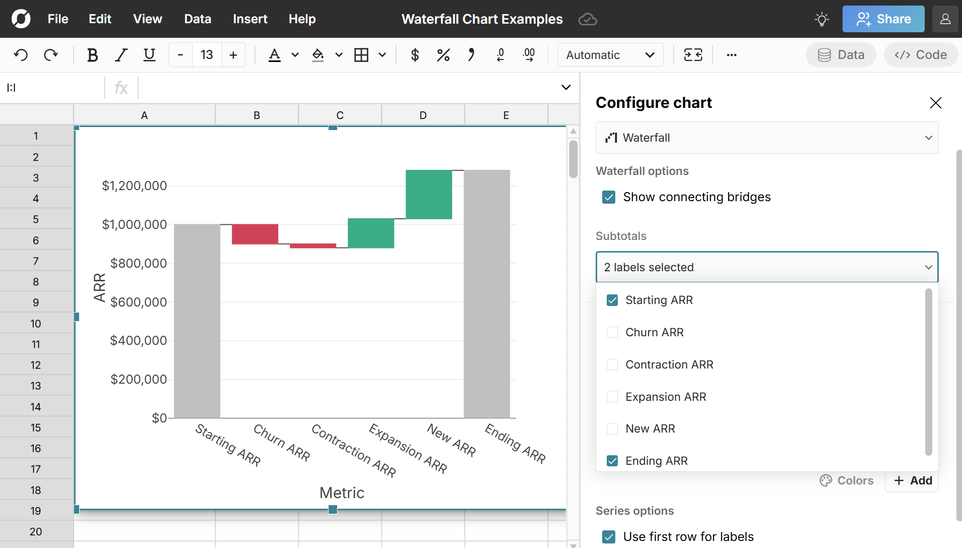
- Set bars as subtotals - subtotal bars are anchored to the X-axis and represent a cumulative total at a specific point in the sequence. The starting and ending value are often set as subtotal bars and sometimes intermediate subtotals are as well (for example quarter subtotals in a year). Subtotal bars help distinguish totals from changes.
- Change the color of subtotal bars, positive bars, and negative bars. You can edit waterfall chart colors for each series. If you have multiple series (e.g. actual vs budget) you can set them as different colors to better visualize each series.
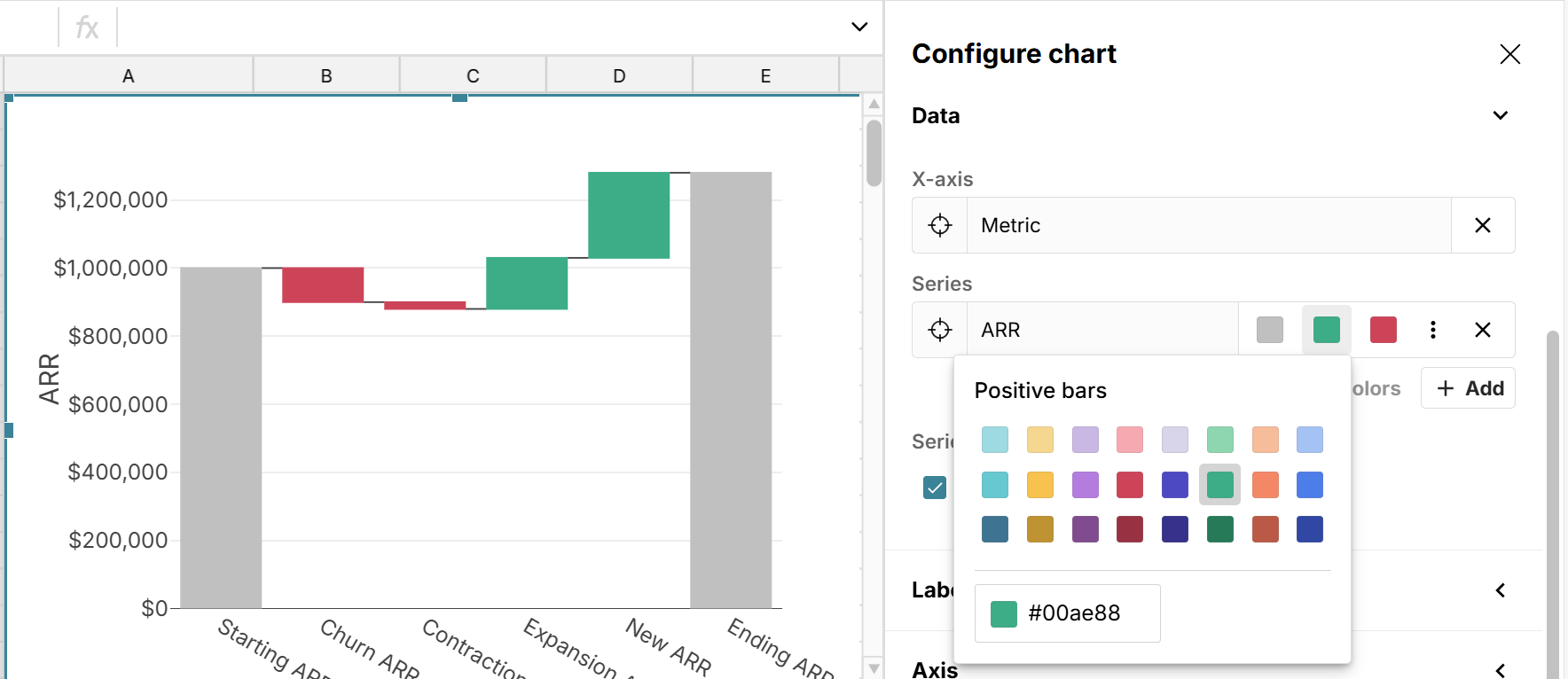
- Use the first row as labels - This toggles using the first row in your range as labels
You can also add a title, edit labels, and configure a legend in the chart editor. Note that when you hover over a bar, it shows you the impact of the bar, including the net change, prior value in the sequence and new cumulative value in the sequence as a result of the change. 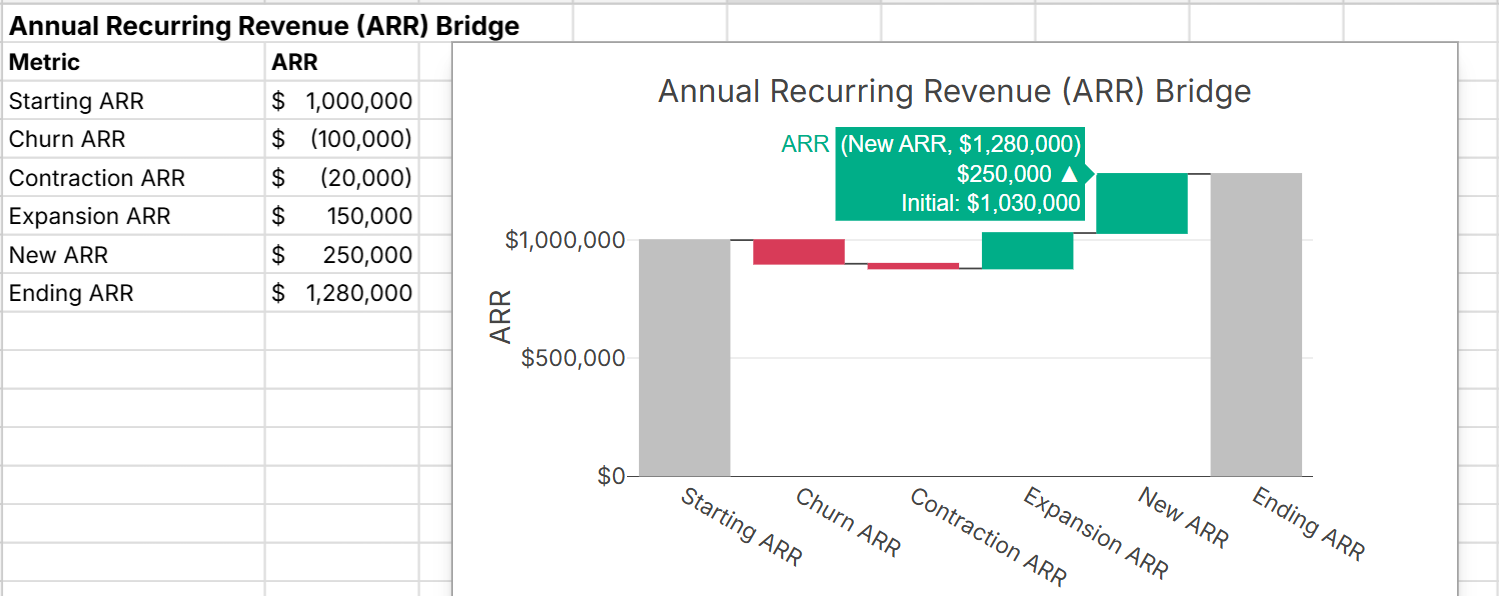
How to automate waterfall chart updates
In Row Zero, waterfall charts automatically update as source data changes. You can easily connect directly to your database or data warehouse, insert a connected table, and build pivot tables and charts on top of your connected data. Everything built on connected data stays in sync and can be set to automatically update with scheduled refresh.
Example waterfall charts
Waterfall charts are used in business and financial analysis for a variety of visualizations. Below are examples of various types of waterfall charts. You can also view live examples of waterfall charts in a spreadsheet here.
- Change drivers in a time period - Show how different components impacted a value over a time period (e.g. recurring revenue change)
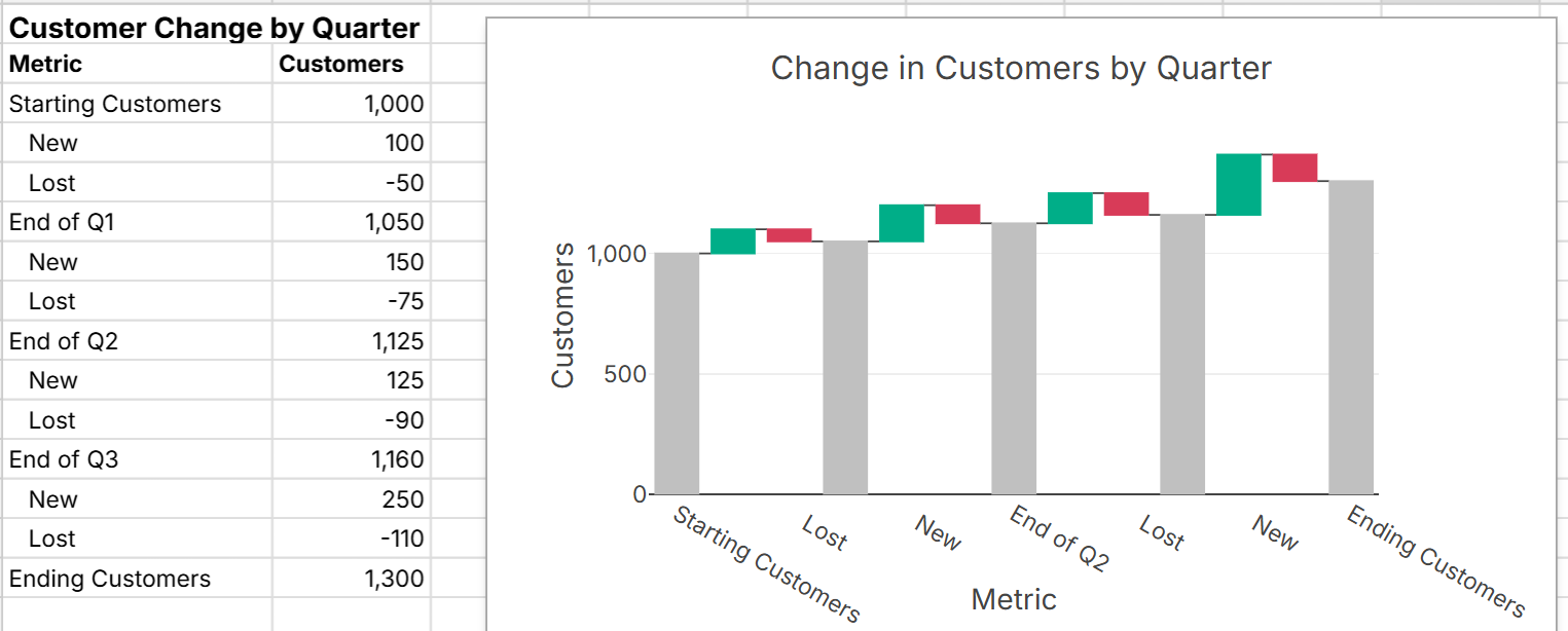
- Change drivers over multiple periods - Show how components impact a value over multiple time periods (e.g. quarter-by-quarter customer change)
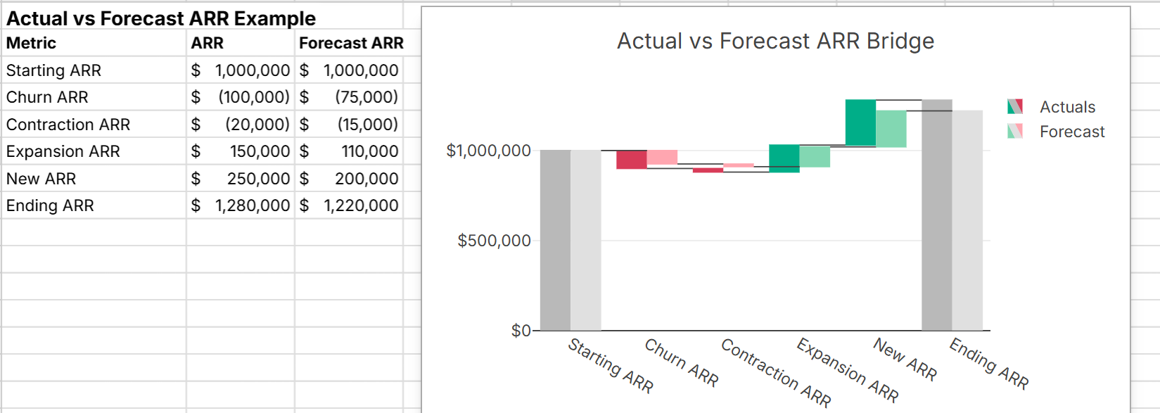
- Actual vs budget forecast - Show a breakdown of actual vs forecast by component so you can see where you beat and missed forecast budget
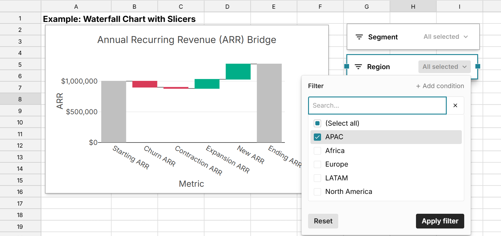
- Waterfall chart with a slicer - Slicers let you further filter your waterfall chart on underlying data, so you can quickly explore deeper drivers of change. Row Zero makes it easy to add slicers to waterfall charts and other visualizations.
While the waterfall chart examples above are in Row Zero, the process is similar to build a waterfall chart in Excel or Google Sheets.
3 Reasons Row Zero waterfall charts are powerful
Row Zero is an enterprise-grade spreadsheet that makes it possible to analyze massive datasets in a dynamic spreadsheet. Here are 3 key features:
- Big data - Row Zero supports 1000x bigger datasets than legacy spreadsheets, so you can easily create big data waterfall charts in a spreadsheet.
- Connected - Row Zero can connect directly to your database or data warehouse, so you can easily build a connected waterfall chart that updates in sync with your data source.
- Dynamic - Row Zero waterfall charts automatically update as source data changes, so whether you edit or filter source data or update with new data, waterfall charts dynamically update. You can also create waterfall charts from pivot tables and add slicers to waterfall charts to make it easy to drill down into specific sub-categories.
Pros and cons of waterfall charts
Pros of waterfall charts
Waterfall charts are good for showing breakdowns of a total or explaining step-by-step changes between two values and are especially useful when there are both positive and negative components.
- Good for step-by-step changes: Waterfall charts make it easy to follow step-by-step changes to a value.
- Highlights drivers: Makes it easy to see which items contribute the most to increases or decreases.
- Good for visualizing variance: Waterfall charts make it easy to explain the difference between two values, as well as the difference between a forecast vs actual values.
Cons of waterfall charts
While there are several good use cases for waterfall charts, there are also some limitations and drawbacks to be aware of:
- Quickly become cluttered: Waterfall charts can become cluttered if too many categories are used, so they are best for summary data.
- Sequential dependency: Interpretation can change depending on the order of bars, so you need to be thoughtful about ordering.
- Hard to compare: Waterfall charts are not great for comparisons across multiple categories simultaneously and quickly become hard to read with more than 2 or 3 series.
Conclusion
Waterfall charts are a good way to visualize variance between two values or two plans (e.g. budget vs actual), and are especially useful when you have positive and negative contributors. Row Zero is an enterprise-grade spreadsheet built for big data that makes it easy to create dynamic waterfall charts in big spreadsheets. You can connect directly to your data source and automate waterfall chart updates. You can also add slicers to waterfall charts to further analyze sub-categories and components. If you need extra help with waterfall charts, view our live waterfall chart examples in a Row Zero spreadsheet to see exactly how they work.