Pivot tables are a popular spreadsheet feature that originated in Lotus Improv in 1991 and were introduced to Microsoft Excel in 1994. I first learned about them in 2012. At the time, I didn't understand pivot tables. I tried to use them, a little bit, but I found the pivot table interface in Excel inscrutable. And Microsoft's documentation isn't any help:
A PivotTable is a powerful tool to calculate, summarize, and analyze data that lets you see comparisons, patterns, and trends in your data.
Ok, but what is a pivot table? How do I use them? What kinds of summaries do they produce, and how can I use them to analyze data? I found these questions difficult to answer, and so I set pivot tables aside. I didn't return to them until 2023, when I took up the task of implementing the pivot operation for Row Zero.
Now, I finally understand pivot. So I'm here to write the explainer that I wish I had when I first encountered pivot tables twelve years ago. Maybe someone else will find it useful.
The headline: pivot is just a shorter, fatter group by. But what's a group by, and what would it mean for such a thing to be fat or short? The rest of this article will attempt to clarify by first describing two other operations that pivot resembles: unique, and group by. If we understand those, then it's only a short distance from there to the place where the title of this article will make sense.
All of these operations are operations on tabular data. That means data which is arranged in columns and rows. And these operations also output a table — table in, different table out. In a spreadsheet, a table might be a range of data, like A1:G2000000. But the pivot operation isn't specific to spreadsheets, and can be done on any data that's arranged as a table.
I'll be showing examples from the Social Security Administration's baby name dataset. This data is a table with 4 columns and 2,116,840 rows (as of 2023). If you want to follow along, you can make a copy of my Row Zero workbook by clicking the button below.
Let's call the columns of the source data "fields", because pivot tables use the word "column" for something else. The source data has four fields: Year, Name, Sex, and Count. Each row shows how many babys of the indicated Sex, born in that Year, were given the Name that appears on the row.
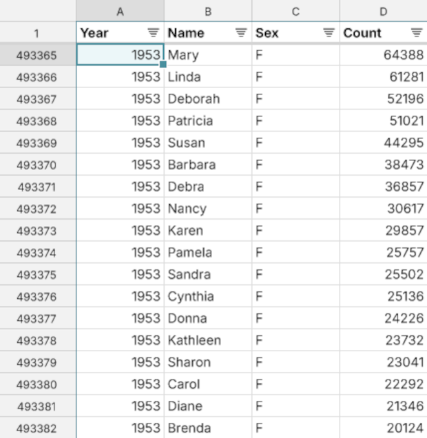
So for example we can see that 22,292 baby girls were given the name Carol in 1953, in the United States.
Uniques
Each field in the data contains repeated values. For example, the Sex field contains only the values M and F.
Let's imagine a pseudo-code function that allows us to ask for the unique values of a field on a table. Something like
table.unique(fields: ["Sex"])
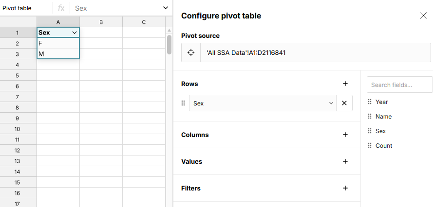
and imagine the output of this function is another table. That table would have one row per unique value of the Sex field — i.e., just two rows. In Row Zero, you can accomplish this task by selecting the entire table of baby name data, right click to Pivot Range, and then drag the Sex field to the "Rows" section of the pivot configuration.
Our pseudo-code function takes a list of fields to compute uniques for. If you give it more than one, it gives you back a table with all unique combinations of values for those fields that occur in the source table. For example, if we give it Sex and Name, we'll get one or two rows for every name that appears in the table. If the name occurs for both boys and girls, we'll get a row with M and a row with F. Otherwise, we'll just get a single row.
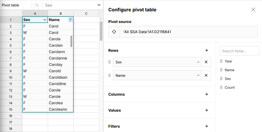
You can achieve this output in Row Zero by dragging the Name field to "Rows" in the pivot configuration, too. We can see from the result that the name Carol is used for both boys and girls, but Carolanne only occurs for girls.
Computing uniques for Year, Name, Sex, and Count in our baby names data would just give us back the same table, since the input data has no duplicated rows.
Group By
Our uniques operation required us to specify a list of fields to compute uniques for. But what about the other fields in the data?
One thing you can do with the other fields is just omit them. That's what the uniques operation does, implicitly.
But there are other things you might want to do with a column. Remember that each row of our output table corresponds to one or more rows of the input table. So we could summarize that set of rows. To do this, we need to specify an aggregation function that tells us how to summarize. In plain English, what we want is a way to express something like, "Add up the value of the Count field for all matching rows of the input table." This is a group by operation. We call it that because we're grouping the data by Year and Sex, and then summarizing some statistics for each group.
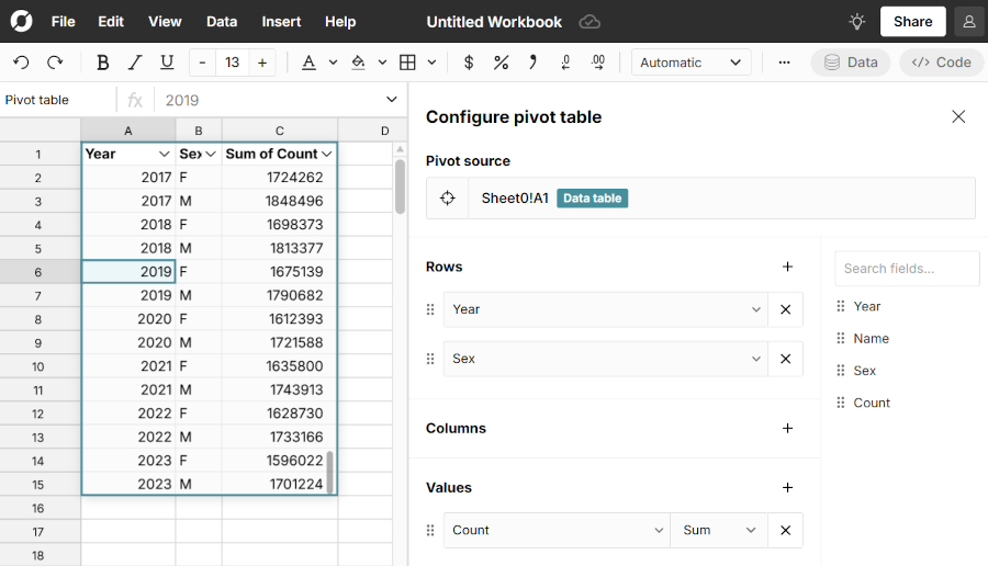
For example, to sum the Count field grouped by Year and Sex, in pseudo-code we'd write something like
table.group_by(fields: ["Year", "Sex"], values: { "Count": sum })
This will show us how many total babies of each sex were born in each year.
You can do this in Row Zero by dragging the Year and Sex fields to "Rows" in the pivot configuration, then adding Count to "Values". We can see from the result that in recent years, there are more baby boys than girls in the data.
We can extend this with different summary statistics options: average, count, median, etc., in addition to sum. You could also allow summarizing the same column in multiple ways: adding a Sum of Count column and an Average Count column, for example.
Notice that the unique operation from the last section can be expressed as a group by that just omits the other fields and doesn't include any summary statistics. Uniques is just a special case of group by.
Pivot
Now we're in a position to define the pivot operation. Just as uniques can be thought of as a special case of group by, group by can be thought of as special case of pivot.
A pivot differs from a group by just in that each of the fields we're grouping by must be put into one of two buckets: "Rows" or "Columns". The special case that's equivalent to group by is when they're all rows. We can rewrite the group by from the last section in pseudo-code as
table.pivot(rows: ["Year", "Sex"], columns: [], values: { "Count": sum })
In fact, that's exactly what we did in the pivot configuration to produce the group by result, if you were following along in Row Zero.
So the obvious question is: what changes if we move one of our rows to columns instead? Here's what you get if you take the previous example and move Sex to "Columns".
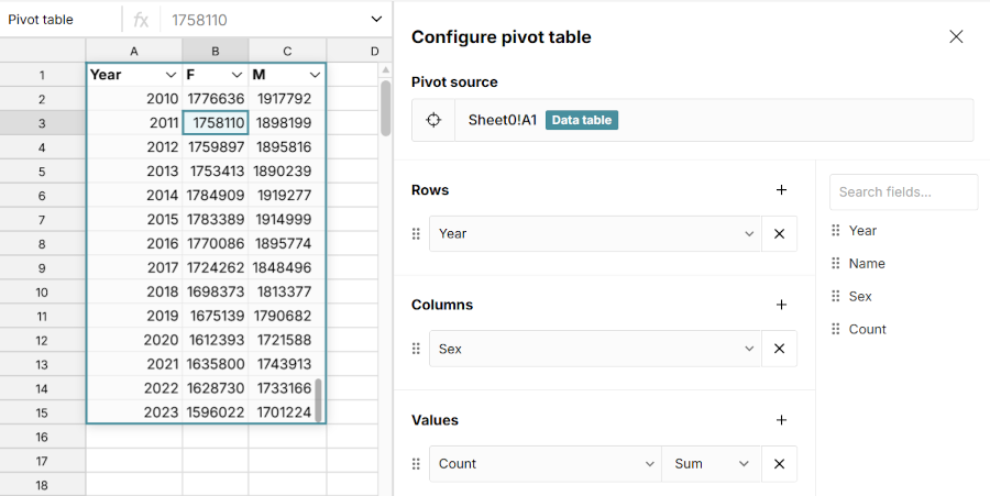
We no longer have a Sex column on our output table. Instead, we have one column per unique value of the Sex field. The Sum of Count column has also disappeared. Instead, the M and F columns are implicitly showing the Sum of Count for the corresponding Year and Sex. The table also now has fewer rows — in fact it's precisely half the size, because we now have just one row per year instead of two.
The thing to see is that the data in the output table hasn't changed. We've still done exactly the same grouping, with exactly the same summary statistics. The table has just been rearranged. The Sum of Count for 2022, F is still there, it's just now the value of the F column for the row 2022. And the 2022, M sum is also still there, also on the 2022 row (in the M column, naturally).
In this particular example, our pivot table is the same width as the groupby from the last section. But that's only because the Sex field has just two unique values. Since we have one column per unique value, if the input data had more than just M and F, the output table would be wider. And it's shorter, because the output table only needs one row per year to display all the summary statistics, intead of two. So that's what I mean when I say that pivot is just a shorter, fatter group by.
It gets a little more complicated when you have more than one summary statistic, or more than one field in Columns, but the basic idea is the same. We just do a group by, then rearrange the table to make it shorter and fatter. No new information is contained in the pivot. It's just presented differently and is (maybe) easier to read.
So if you understand group by, you also understand pivot. All of the examples we've used in this post can be constructed as pivots, and were if you were following along in Row Zero. Pivot is the same fundamental summarization of the input data as group by. For me, that was the crucial insight that finally rendered pivot tables understandable.
Why Pivot?
When I've tried this explanation out on people in the past, a common response has been, "What's the point of pivot, then?" If it's the same summary as group by, why pivot?
One obvious answer is that maybe you just prefer the table layout that pivot produces or find it more legible. A less obvious answer is that it's useful for constructing charts. In Row Zero, if you select the output table from the last section and click the "Insert chart" button (and change the chart type to Line, if necessary), you instantly get a chart showing the count of baby boys vs. baby girls by year.
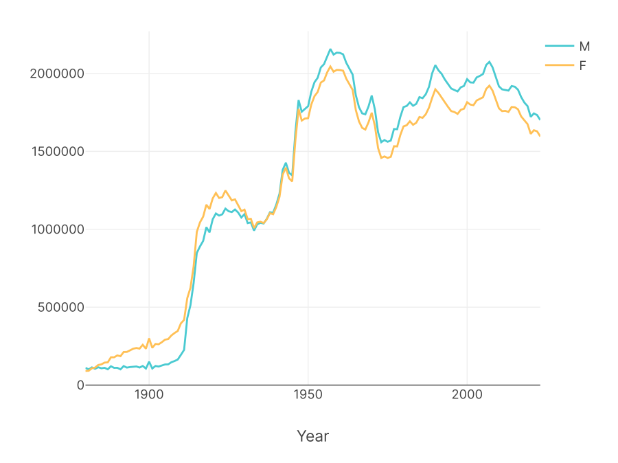
Each column becomes its own graphable series of data in the pivot. Pivot tables are especially powerful when combined with charts in Row Zero.
Conclusion
Don't be daunted by the pivot table configuration panel! Just remember that the "Rows" and "Columns" sections are just different ways of specifying which fields you want to group by. And "Values" is where you specify the summary statistics you want for each group. "Filters" just let you filter the input data before applying the pivot transformation.
I like to construct my pivots by imagining the group by I want to perform and building that first, using Rows only and no Columns. Then maybe I move a field or two from Rows to Columns, to get the final shape I want.
And that's pivot explained as simply as I know how.